Fitbit Sense & Versa III
Summary
In 2019 I took over leadership of the Fitbit Smartwatch team with the mandate to create two new smartwatches, the affordable Versa III, and premium Sense I. I led a team of five UX designers, four visual designers, one prototyper, and one animator. We were supported by a dedicated UX writer and two UX researchers.
Goals
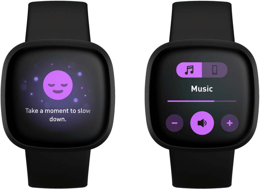
User research and market analysis had shown a growing demand for stress management tools. Apps like Headspace and Calm were gaining popularity, but lacked hardware integration.
In response, Fitbit leadership aligned around two major goals. The first was to develop a new biosensor, algorithm, and experience that could monitor user stress. The second was to launch Fitbit’s first FDA-regulated heart irregularity detection feature.
Process
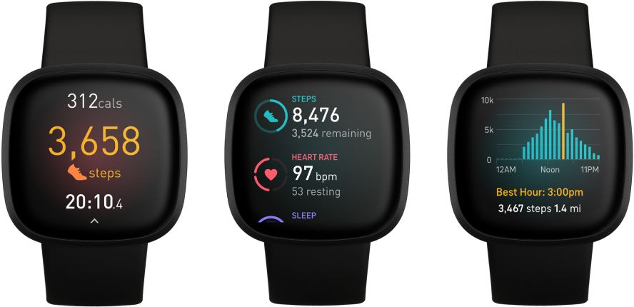
Product leadership provided a stack-ranked list of feature requests. I worked closely with the lead engineer to evaluate technical capacity and lock in a feasible scope. During this process, I advocated for solving long-standing user complaints and succeeded in gaining alignment on two major upgrades: a redesigned navigation system and a new glanceable widget framework.
With engineering and product committed, I organized the feature roadmap, assigned teams, and produced a master program schedule—later adopted by engineering for development tracking.
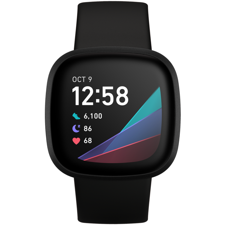
For my part, I redesigned of the OS navigation architecture. The update addressed limitations in the new button technology and aligned the interaction model with evolving industry standards. Design work was divided into small functional groups, with each team presenting weekly reviews to me for critique and guidance. I ensured alignment across product, UXR, and engineering at every major milestone.
Collaboration
A major problem emerged halfway through the program, centered on the watch’s unique solid-state button. This new button technology was designed to measure force against the aluminum frame, promising up to ten levels of pressure sensitivity.
However, due to a misalignment between hardware teams, the button sensor was relocated during late-stage development, dramatically reducing its accuracy. At this stage, the hardware changes were no longer feasible. Button reliability dropped to just 70%.
For the next five months, I worked daily with UXR to evaluate button performance. We developed a battery of interaction tests, iterated firmware tuning with engineering, and eventually brought performance up to 90% reliability.
Research
With dozens of new features and updates, my team turned to a rapid testing process that closely resembled speed dating. The format of each test varied by feature, but all included prototypes, ranging from paper mockups to fully interactive digital prototypes.
Results
As predicted by our UX research, reviewers and users immediately noticed the issues with the solid-state button. However, The Verge called the new navigation a critical success, without which the device would be frustrating to use. After the launch, I collaborated with the director of UXR to codify a formal set of functional requirements for all Fitbit’s interactive touchpoints. These KPIs defined acceptable thresholds and warning indicators, ensuring future products would avoid similar interaction pitfalls.